Mmmmm Fabric
Fabric for this project was and is always going to be something of a challenge. The problem with trying to replicate a historical garment I have found is that our modern fabrics are different( width/fibre content/quality etc.). Man made fabrics are of course a 20th century invention and account for a lot of what is out there. My dress, is au natural, with beautiful silk and silk satins, so what I buy and use will be as close to the original as possible.
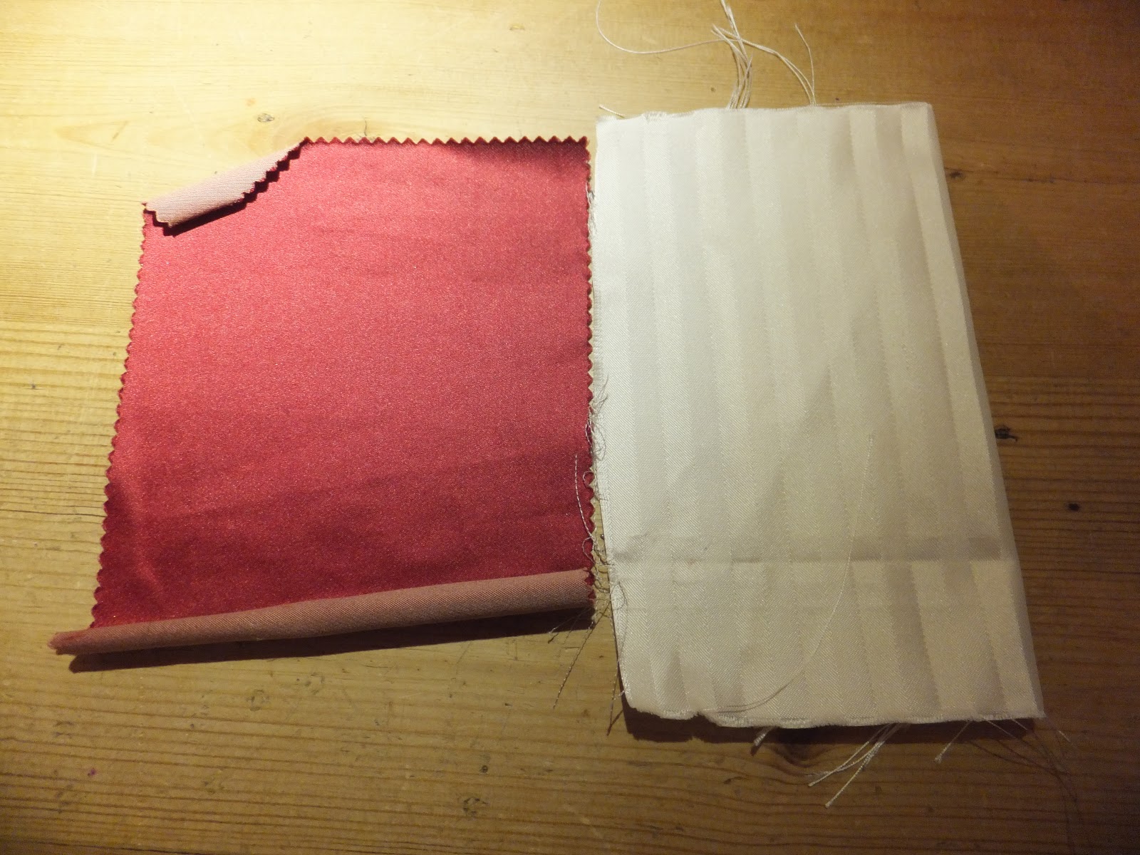
Looking closely at the two main fabrics, there is a wine/maroon, medium/heavy weight satin(possibly duchesse) and the stripe is a matching shade of wine satin and the off white/ cream stripe is actually grosgrain(!) which I would imagine is going to be near impossible to match.

The Search Begins in Earnest
My first stop was London. I spent a day between Shepherds Bush and Soho, trying to get a feel for what was available.
Shepherds Bush did have some wine silk satin's but I know that I need to find the stripe first, and then match the plain satin to the stripe, as the stripe is going to be harder to source. I did bring a few small samples out of Shepherds Bush, but the quality-although 100% silk, apparently, didn't feel right.
On a side note, I always knew that the fabrics for replicating this dress would be expensive. The competition does state you can make in calico if cost is an issue, or you can find similar(but less expensive fabric). I have decided though that this will be a large and important edition to my portfolio and therefore I am willing to spend out what needs to be spent on fabric.
Soho proved to be a disappointment. Some of the most amazing silks I have seen, but none for my project, stripes it seems, are just not in.
The only sample I came away with was an all white silk with too large stripes, in the complete wrong texture. Not nearly enough finesse; if this was a stage costume, you could probably hand paint in the wine colour and it would look very effective to the audience, but re-creating the period garment the choice has to be right, or you might as well not bother as it will be clear from a mile away that it looks out of place.

Onwards Towards the Internet
My next step was to have a look online at Whaleys/ James Hare etc. I broadened my search to include home furnishing fabrics as well as fashion fabrics. I got very excited when James Hare provided me with a glimmer of hope, and I ordered several samples. They did appear to be the only place at this point in time that I could find with any stripes that were at all close to what I needed.


The above samples were what arrived. The top two samples are called Pavilion stripe. It is a relatively cheap (£20ppm minus VAT) thin dupion stripe, which I know has been used as the default period stripe fabric for at least two previous JAA makes from AUCB, and I don't like it much (thankfully neither did my tutors). The proportions are wrong, the texture is wrong, the weight, the colour- its all wrong. Next!
The last sample, shown just above, sparked my interest a lot more. The colour is called Chili, and is quite orange, but I could overlook that. The silk/cotton mix satin was of a much better weight and quality and actually resembled the original. The stripes, although the wrong proportion(a mix of silk and linen) were striking, and the texture was more in the ball park of the original, with the grainy stripe and the satin stripe. I was quite hopeful, and I kept looking at it and holding it up and imagining it in a full dress.
A Rather Important Reflection
More often than not, as I keep learning and working and getting towards the end of my degree I have moments when I will suddenly see where I make my mistakes, which always means progress as a practitioner. The last fabric sample was a prime 'lightbulb' moment. I got carried away. Having found a fabric, that 'kind of' worked, I somehow convinced myself that it would work. I got overexcited and forgot about one of my earlier costume making epiphany's where I learnt that it was vital to take a step back and be really honest.
Honestly, this fabric was not right. As I said earlier in this post, it "has to be right or you might as well not bother". This fabric has the wrong proportion of stripes, and as long as that is wrong the whole dress will look out of proportion to the original, the fabric was too modern, and looked the furnishing fabric that it was.
So another lesson learnt. With period costume, the right fabric is essential, this is my mantra.
Back to the Drawing Board
Now was the time to go digging through the fabric archives available at uni. Up until now it hadn't really been accessible due to all the building works and its new home. I spent many hours looking through all the sample books from many various fabric companies, and I had to keep going back. At some point I came across the Bennett's catalogue where I found a stripe in all white that looked about right in proportion. In the same book further along, I found the same fabric in several different colourways- one of which was a gold/claret. Alongside them in the samples are matching duchesse satins.


The most important thing about this stripe( 100% silk damask) was the proportion of the stripes was almost identical to the original. Having remembered my previous lesson however, I did not get overexcited as, neither the all white or the gold/claret was right. The white was missing the bold striking contrast of the original white/wine combo and the gold/claret looks all gold in some lights(owing to the gold weft running through and across the claret weave). It also took a long time to find a matching shade of satin to the gold/claret.
When the large samples were delivered(the ones pictured) it really helped and finally I conceded that I had found a pretty good match in the gold/claret and matching duchesse satin (£54pm, £43pm respectively).
If I had more time, then maybe I could find something even better. But there also has to be a balance between what is right and how much time you have. I brought the samples to the original dress and laid them out on top to really get an idea. The gold/claret does indeed match perfectly in terms of proportion of the stripes, they are both beautiful quality fabrics that will add to the look of the final piece and as I have to start cutting in top fabric very soon if I am to stay on schedule I am out of time as well. But happy with my choice and very excited to get on with the dress in top fabric.
Below are the photos that I took of my fabric samples against the original garment. You can see that the damask silk, white and gold/claret is in perfect proportion and I think this has been a very important element in terms of the dress coming together. If I had settled on an earlier fabric with the wrong proportions, the dress would not resemble the original in such a way, I can only use my imagination but I think the end result with a different fabric would look very different and not nearly as successful.


There is More to Come
Needless to say, its not just the main top fabric I need to consider. Lining, lace, facings/interlining thread all need just as careful consideration and I will be looking more closely into these in a subsequent post.
No comments:
Post a Comment